Kaldan Samudhra Palace is a landmark beach resort in Chennai, envisioned as a sanctuary of grandeur by the sea. Set across 10 acres, it draws inspiration from the splendour of Rajasthani architecture, seamlessly blending traditional craftsmanship with refined modern comforts. This palace resort is a rare experience of royalty reimagined on Chennai’s shores.

The key challenge was to strengthen Kaldan’s social media presence in a way that not only captured attention but also converted interest into direct bookings for stays, dining, and events. With low direct bookings and a heavy reliance on Online Travel Agencies, Kaldan needed a stronger digital strategy to boost visibility, build brand recall, and create a more direct connection with its audience.

Our mission was to establish Kaldan Samudhra Palace as the preferred destination for luxury staycations, grand weddings, and exclusive gatherings by building a strong presence across digital and on-ground platforms and shaping its identity as a true symbol of elegance and celebration.
Inspired by the Arabic root “KHALADA,” meaning immortal and everlasting, the name Kaldan comes from "Khaldun," representing infinite duration and eternity. Embracing the noun "KHALD," which signifies endless time and paradise, Kaldan was chosen to evoke a sense of immortality and the timeless beauty of paradise—reflecting the essence and vision our team aimed to bring to this brand.
The Kaldan logo features a beautifully designed drop, inspired by a heavenly element—mana from the Gods—symbolising renewal and immortality in paradise. Diamonds placed inside the drop reflect the brand’s dedication to luxury. This logo brings together the richness of eternal paradise and the allure of timeless elegance, promising an everlasting luxury experience.
The colour palette features Topaz—a warm, golden hue that suggests luxury and richness—paired with Sacramento State Green, a deep green shade that represents renewal and freshness. This combination creates a balanced look that’s both elegant and vibrant.

The primary font is Visby CF, chosen for its clean, modern lines and versatile appeal. The secondary font, Montel Regular, adds a touch of elegance and readability, complementing the main typeface for supporting text or sub-headings. Together, this combination ensures the brand identity is both stylish and easy to read.
To position Kaldan as a standout luxury palace resort, we focused on highlighting its royal hospitality, seaside location, and unique Rajasthani-inspired architecture. We crafted a brand narrative that blends timeless elegance with modern comfort, ensuring Kaldan stands apart as a destination for guests seeking exclusivity and rich cultural experiences. Every element, from visual identity to messaging, was developed to communicate Kaldan’s promise of an extraordinary and memorable retreat by the sea.
Kaldan’s tone of voice is defined by a blend of boldness, elegance, and enduring luxury. Guided by the idea of “Luxury meets eternity,” the brand’s communication channels a refined, upbeat attitude with a distinct touch of sophistication. Wherever Kaldan is present, messaging adapts to its surroundings, bringing in hints of cultural richness and palatial charm, while remaining consistently classic and inviting.

Kaldan’s brand philosophy centres on creating experiences defined by sophistication, perfection, and quality. Every aspect of the brand is built on trust, warmth, passion, and integrity—ensuring that guests always feel valued and inspired. We shaped Kaldan’s personality to reflect these values, embedding them into every interaction and detail, so every guest encounter reflects the heart and soul of the brand.
Kaldan is committed to crafting transcendent, luxurious experiences that enrich the lives of every guest. Our palace reflects artisanal mastery, merging elegance and global influences with the timeless essence of immortality, symbolised by the drop in our identity. Rooted in integrity, trust, and sincerity, Kaldan stands for eternal luxury—ensuring guests always feel at home, whether visiting for work or leisure. The promise is simple: to help you feel good, inside and out.
Patterns play a key role in elevating Kaldan’s visual identity by adding distinctive touches that are both deliberate and refined. Every pattern is designed to showcase brand colours and unique elements—like the drop, arches, pillars, and diamond motifs—without overwhelming the layout. To maintain harmony and brand consistency, patterns are only used on Sacramento State Green or white backgrounds and must not be distorted, rotated, or combined in ways not specified in the guidelines.
For key materials such as letterheads, vouchers, and special cards, borders and corners are included using brand-approved colours, while lines help anchor headings and connect graphic elements. Arches and pillars draw inspiration from Rajasthani architecture and are used to add elegance to hospitality menus and celebration cards. Preserving the integrity of these pattern elements ensures every piece of communication is instantly recognisable as part of the Kaldan brand, reflecting luxury, heritage, and attention to detail.
High-impact campaigns using Reels, Stories, Carousels, influencer collaborations, geo-targeting, and retargeting to drive awareness and conversions.
2× increase in booking inquiries via social media
55% increase in direct room bookings
65% increase in restaurant reservations
2× increase in wedding hall inquiries
70% increase in direct calls
Targeted search, Performance Max, local, seasonal, and remarketing campaigns to increase visibility, reduce commission costs, and boost direct bookings.
60% increase in direct bookings in 3 months
80% increase in restaurant reservations
Banquet bookings filled 3 months ahead
65% less OTA dependency
2.5× ROAS with smart bidding
Published relevant blogs and optimised for search to boost organic visibility.
Strengthened rankings and discoverability through continuous content optimisation.
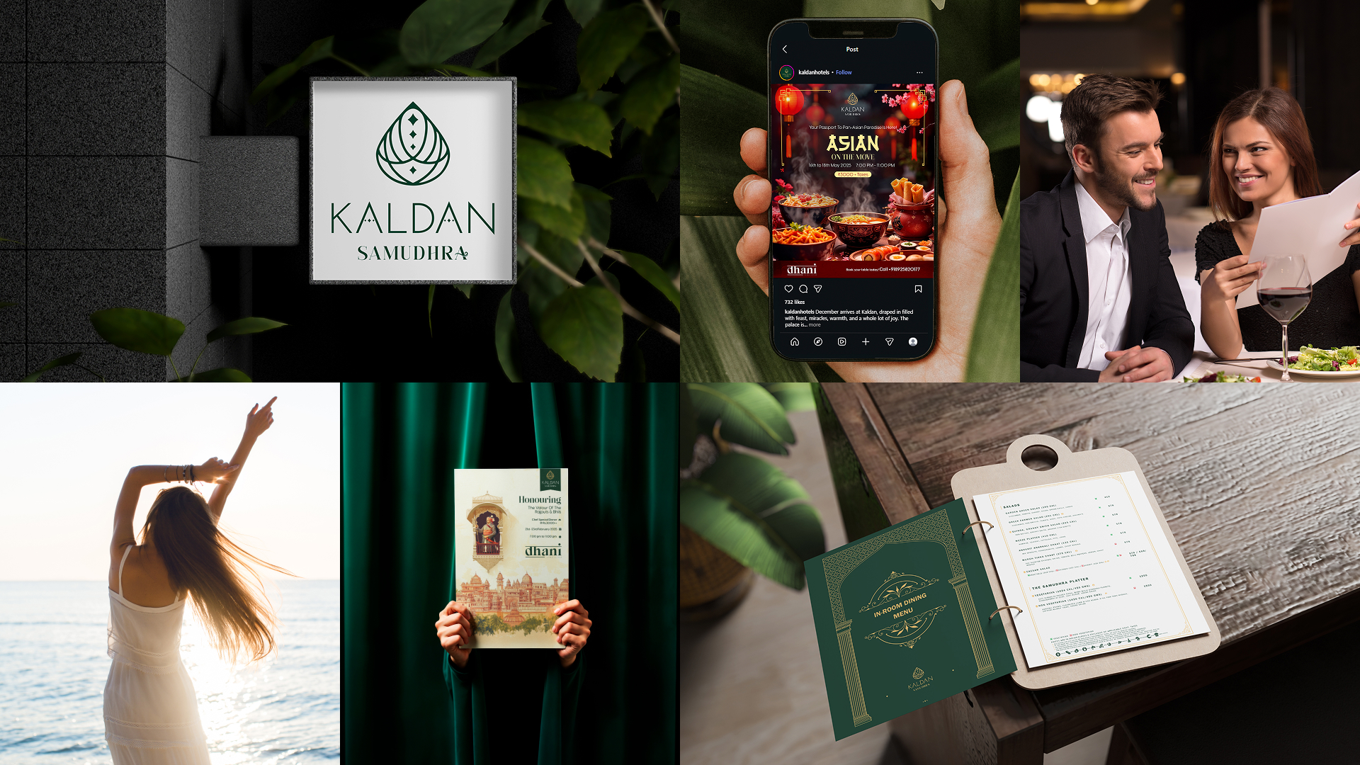
Logo Design: A distinctive logo was created to reflect the grandeur and elegance of the palace, establishing a strong visual language.
Brand Name: Kaldan Samudhra Palace was crafted to reflect Rajasthani-inspired architecture and its serene seaside setting. “Kaldan” signifies “an immortal place in paradise,” embodying heritage, luxury, and timeless beauty.
Packaging Design: Premium gift boxes, takeaway boxes, wrapping paper, pens, paper bags, and wine bags were developed to extend the brand's elegance beyond the property, creating a refined experience with every guest interaction.
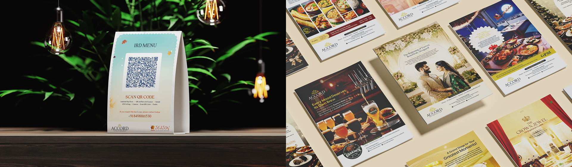
Menu Design: Menus for in-room dining, restaurants, and festive celebrations carried forward the palace-inspired identity.
Visiting Card: Sophisticated visiting cards were developed to represent the brand’s luxurious style with every introduction.
Property Signage: Signage throughout the property features elegant layouts and reinforces brand visibility.
Logos for Key Elements: Distinct logos were designed for property elements such as Dhani, Somapuraa, and Chill With Grills, giving each space a unique identity while maintaining brand coherence.
Corporate Stationery: Our stationery design includes envelopes, notepads, gift vouchers, payment vouchers, welcome cards, gift certificates, birthday and anniversary cards, letterheads and much more. Each item is designed to reflect the Kaldan brand consistently, ensuring all communications are clear and professional while reinforcing the brand’s identity.
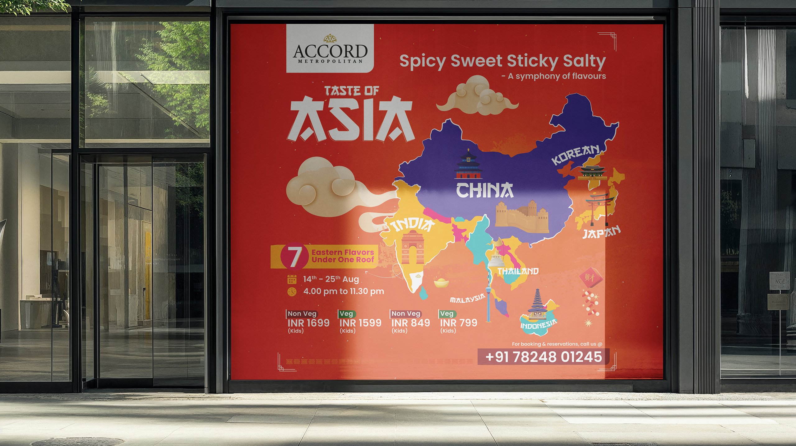
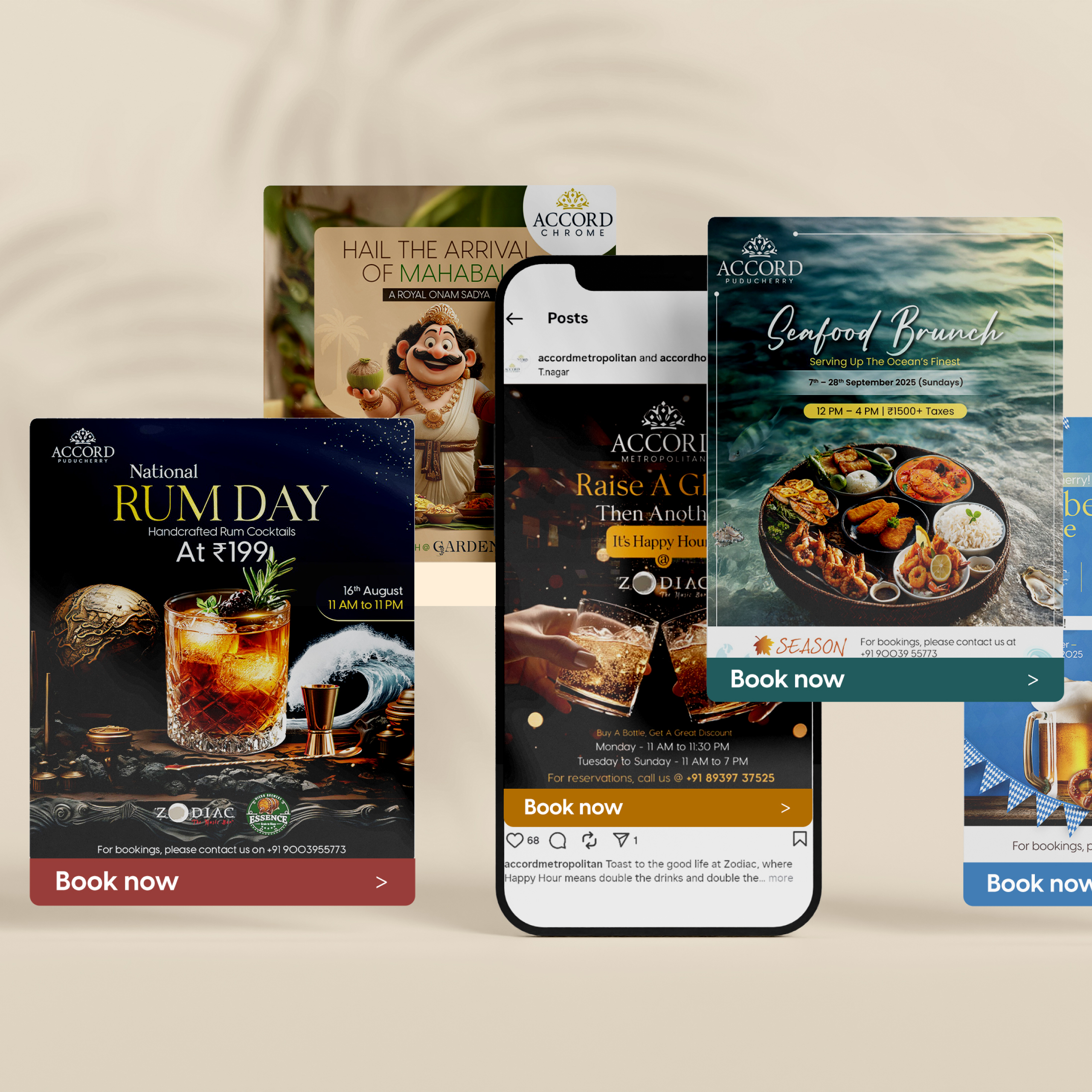
A wide range of marketing materials was designed to ensure consistent brand messaging across all touchpoints. This includes posters, flyers, standees, and event materials that create strong visual appeal and clear communication. The collaterals also include Kaldan Wedding Affair magazine ads, newspaper ads, brochures, and factsheets, all aligned with the brand’s identity and marketing goals.
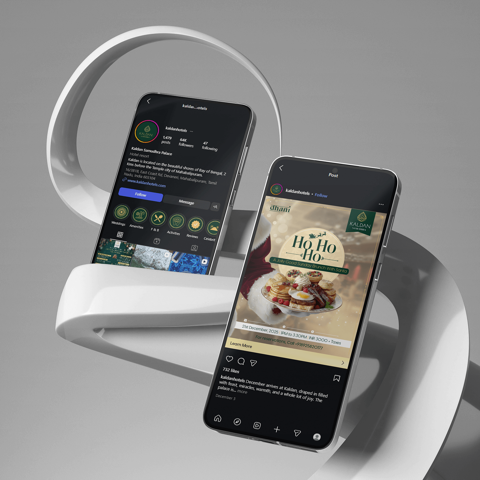
Social Media Marketing: Curated strategies across Meta, Instagram, YouTube, and LinkedIn to strengthen presence and engagement.
Content Creation: Crafted engaging narratives and visuals that captured the luxury and lifestyle of Kaldan.
Photoshoots: Showcased the architecture, interiors, and guest experiences through premium visuals.
Influencer Marketing: Collaborations with lifestyle and travel influencers expanded reach and added authenticity.
WhatsApp Marketing: Built personal guest connections through direct messaging campaigns.
Email Signature: Branded email signatures were designed to maintain consistency and professionalism across all digital communications. Signatures are adapted during promotional events, allowing timely updates and highlights that align with current brand campaigns.
PowerPoint Presentation: Custom PowerPoint templates were developed for brand communications, suitable for business meetings, events, and any guest-facing presentation. Each template ensures a consistent and elegant visual identity across all types of corporate and property-related uses.
Elevated Online Visibility: Increased organic reach, improved search rankings, and a stronger digital footprint.
Growth in Direct Bookings: Reduced OTA dependency with a steady rise in direct room, restaurant, and banquet bookings.
Stronger Revenue Performance: Boosted revenue through more stays, dining reservations, and event bookings.
Expanding Social Community: Built a vibrant, engaged audience that drove conversations, loyalty, and conversions.